
Fall Art
Show Mailer
Promega Corporation hosts seasonal art shows throughout the year, and I had the opportunity to design the mailer for the Fall 2022 showcase. My goal was to create an exciting cover that would intrigue viewers while presenting the information in a clear and engaging manner.
Images
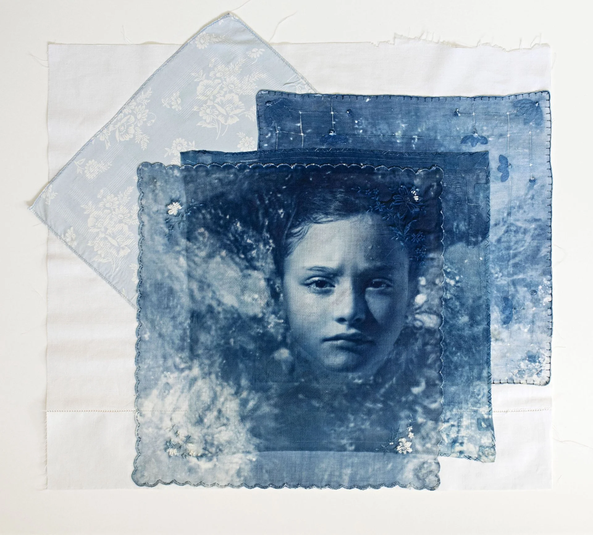
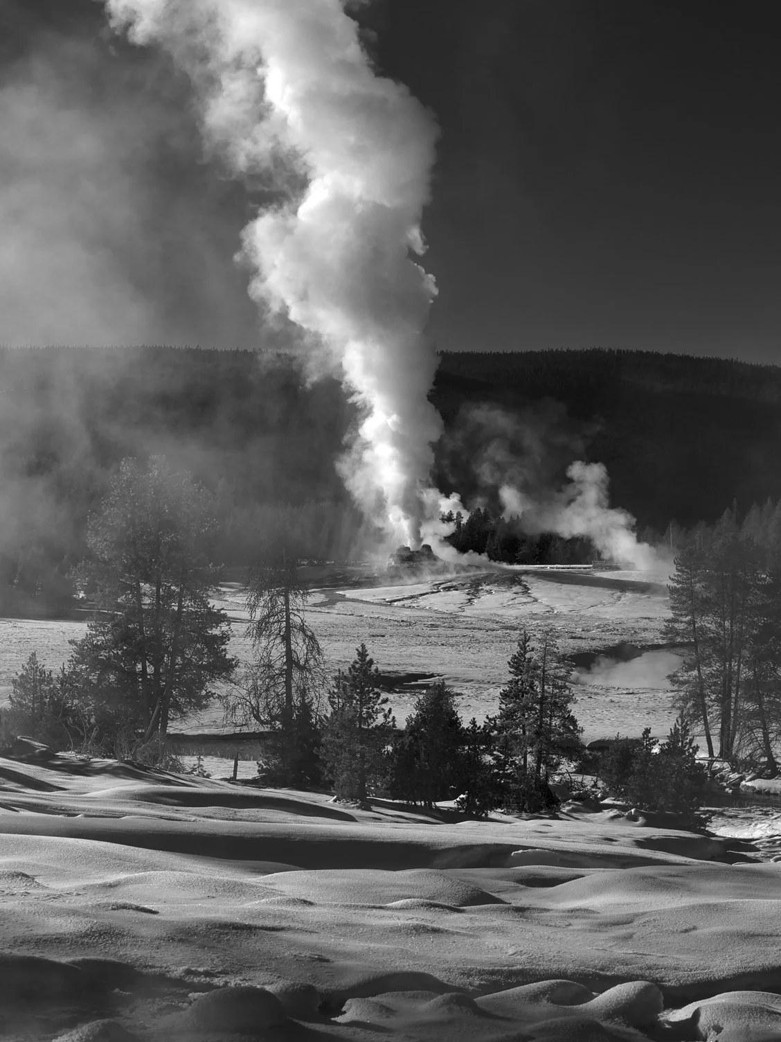
I was provided with photos of the artwork to be displayed at the show to include in the mailer. Although the photos were from different artists, I felt they complemented each other well. Therefore, I decided to arrange them in a dynamic collage on the front.


Content
The content was provided to me as a single-page Word document, and I needed to organize and prioritize it so the back of the mailer would be both visually appealing and easy to navigate. I established an informational hierarchy by adjusting the sizes and weights of the text and using a Promega brand color to make key information stand out.
Design
For the front of the mailer, I arranged the images in a collage, with some overlapping others. While the photos looked nice on their own, the design felt incomplete. To add a dynamic quality and unify the elements, I incorporated white lines of varying weights between and through the images.


One of my biggest challenges for this project was fitting all the required content while ensuring it remained organized and legible. Although I could adjust the size slightly, I had to consider that some people might have difficulty reading the text if it became too small. I learned alternative methods for laying out the content to save space while maintaining a good design.