Bucket List Organic Brewing Co.

The goal of this project was to come up with a beverage brand and design the packaging for the product. Considerations of sustainable practices, ethics, target audience, and brand identity were necessary for the success of the project.
Moodboard
To begin this project, it was important to establish a desired design route, involving typographic treatment possibilities, imagery, and theme. The moodboard is created to visually represent an overall design aesthetic and inspiration.

Name Ideas and Sketches
After establishing what kind of beverage I wanted to design for and what the overall vibe of that brand might be, I started brainstorming names for the brewing company and sketching logos that correlate with that name.


Digital Logo and
Type Explorations
Once I settled on a brand name, I digitally explored type treatment options, carefully considering typeface and scale. I also started to establish the brand logo.


First Iterations
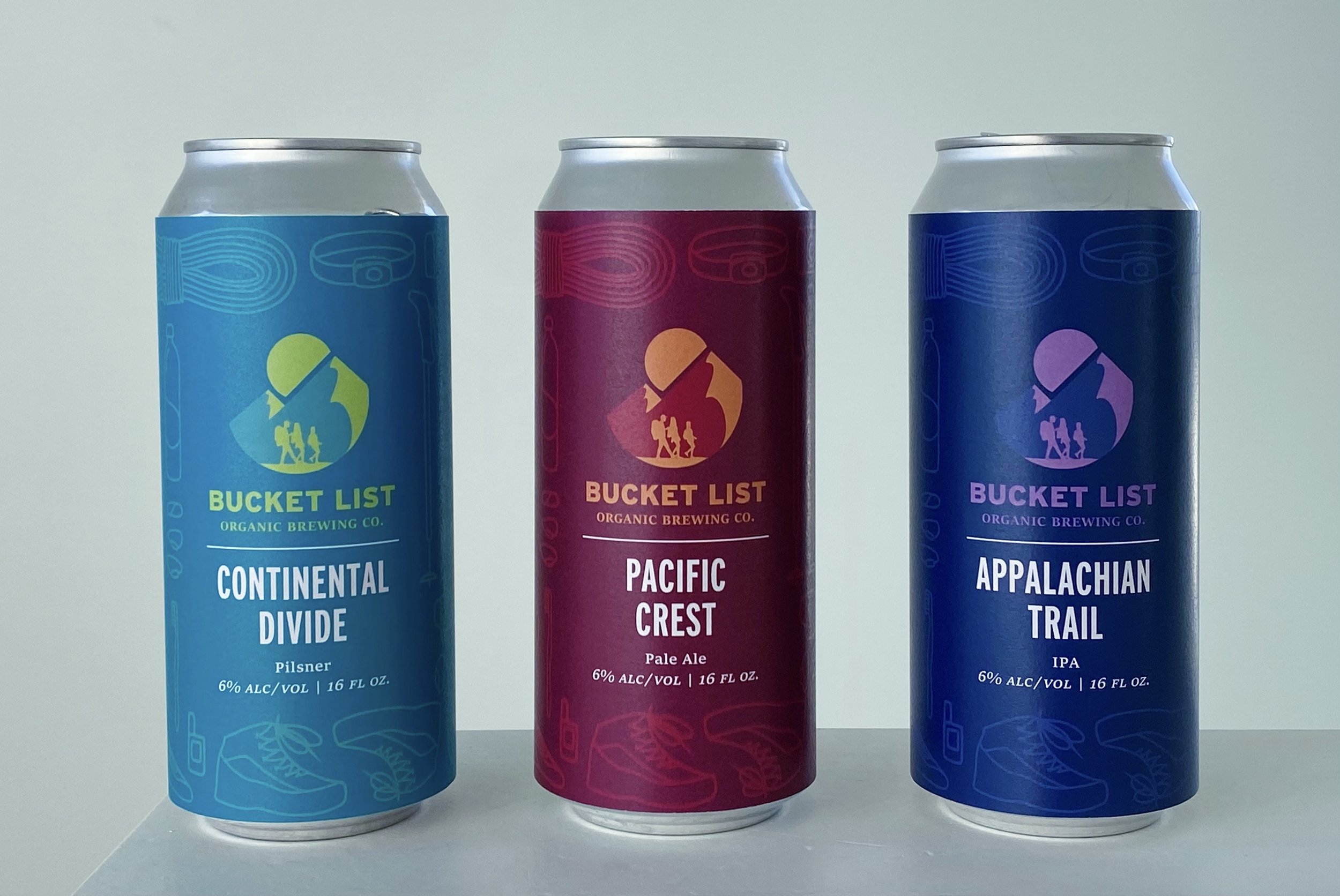
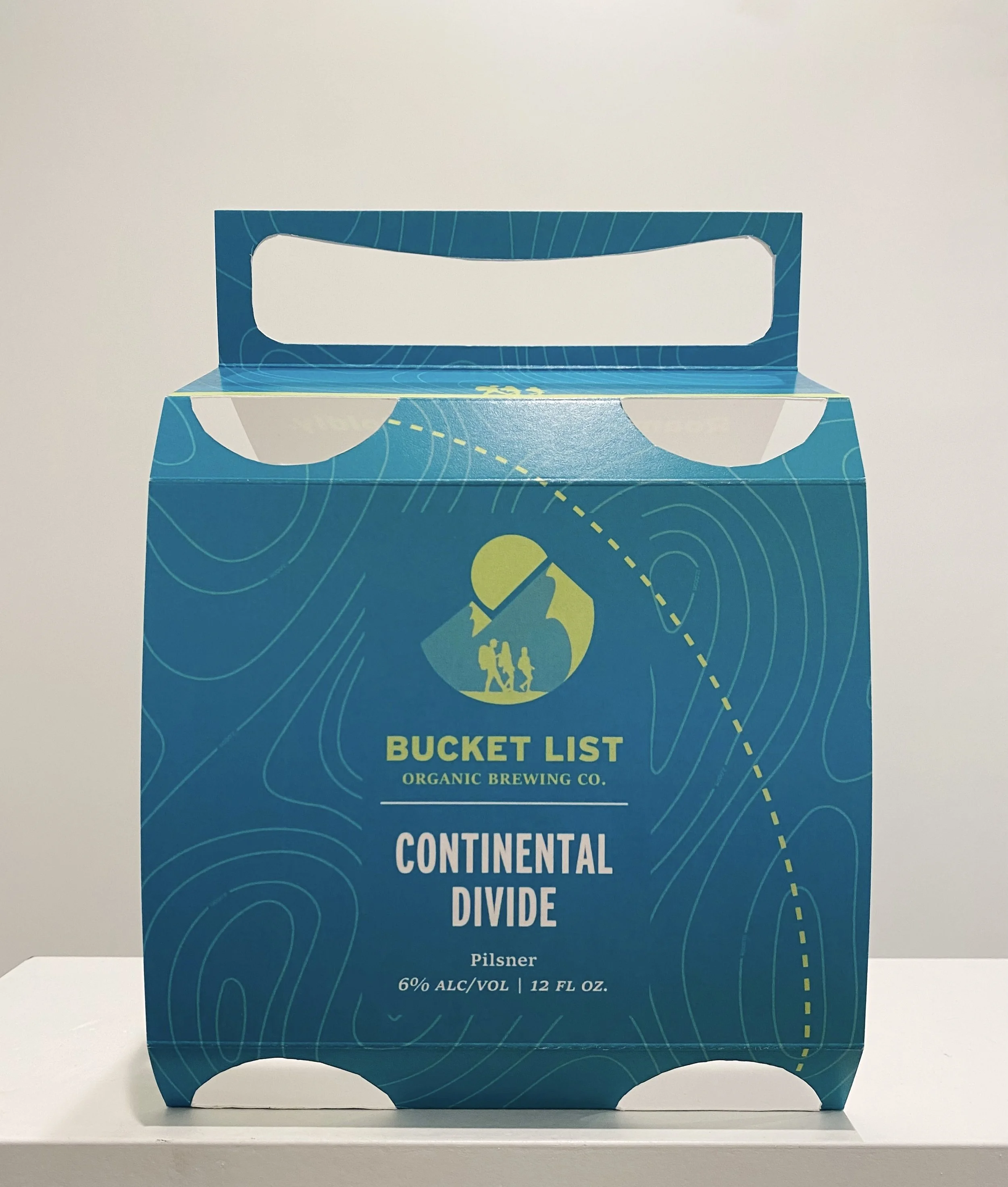
My solution for this project was to work with a beverage I am familiar with and would be excited to design for. I chose beer because that is the go-to beverage for climbing and hiking outdoors in the Summer. I associate beer with friendship, adventure, and community. I wanted to capture these concepts in my brand and design, so I chose the name “Bucket List Organic Brewing Co.” As people who are passionate about the outdoors, it was also important to consider sustainability and packaging practicality. My packaging unit was therefore an aluminum can, which is easy to transport and recyclable, along with a small cardboard carrier that would fold down and easily fit back into a backpack, limiting the likelihood of littering. For me, an exciting part of going on a climbing trip or backpacking trip is packing everything you need. It’s common to proudly take a photo of everything you’ll be using, so my design approach was to create roughly sketched icons of outdoor equipment that would typically go in a backpackers backpack.


Final Design