
Ascend Music App
The primary assignment for this class was the creation of a mobile application from start to finish, culminating in a clickable prototype. I worked with one of my classmates, Megan Nolan, on the following steps to build a music app designed for festival goers, called Ascend.
Our goal was to create an interface that is unique and exciting while maintaining intuitive navigation. Our app, Ascend, allows users to connect with others who share the same music passions; find upcoming festivals that are close to them; listen to full, uninterrupted sets performed at a range of festivals, and even get a better idea of what to wear to the next one.

Phase 1
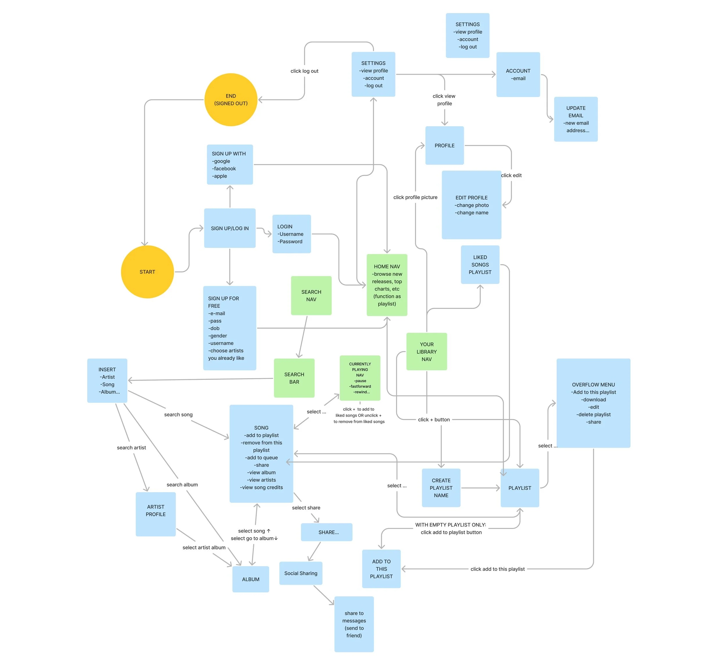
Our process began with research and interviews. We studied existing music apps, such as Spotify, and replicated the user flow that we observed. We also interviewed four people with a range of ages and interests about the current music app they use. We used their responses to identify what works well and what does not, so we could be conscious of user experience when designing our own music app.
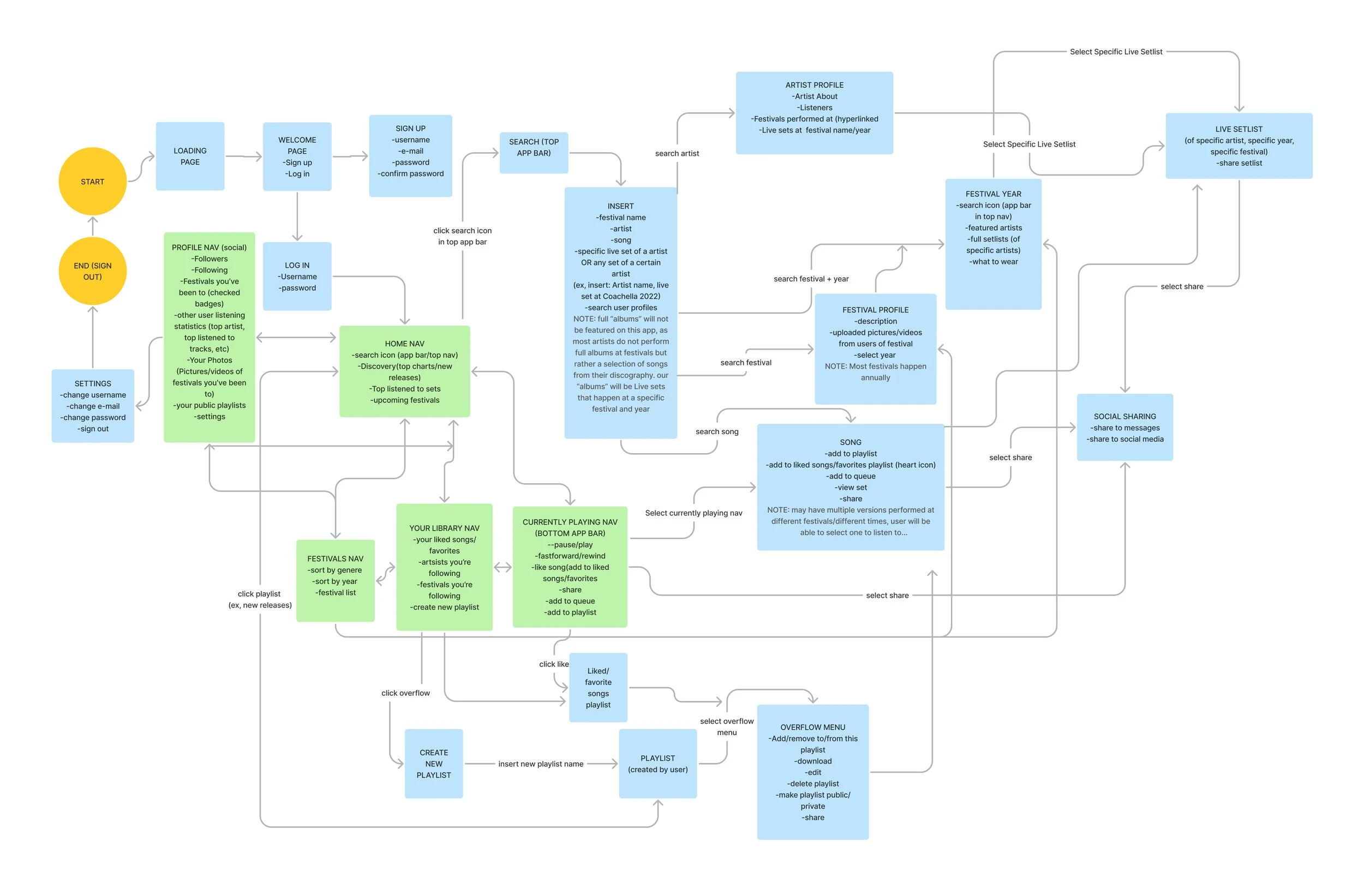
One interviewee wished full sets performed at festivals could be more easily accessible than having to navigate YouTube or Soundcloud, which was the overall inspiration for Ascend. From that point on, we began determining the details of the goals for our app.

Phase 2
In this phase of the project, my partner and I needed to establish our target audience to make sure our app is best suitable for their wants and needs. We created four audience personas that best reflect who we are designing for, then established our initial user flow. After we had a better idea about what our app should include and why, we created the first low-fidelity wireframes of our app.

Phase 3
For this phase of the app development process, my partner and I had the same people we interviewed in phase 1 test our low fidelity prototype. By doing this, our testers caught some details that Megan and I had missed as well as made suggestions for improvements that Megan and I had not yet considered.
Phase 3, Part 2
As an additional step for this phase, we took the feedback we received from our user testing and made edits to the prototype. Our goal for this phase was to make improvements in usability and general layout so users of the app would have an enjoyable experience and navigate the app with no difficulty or confusion.

Phase 4
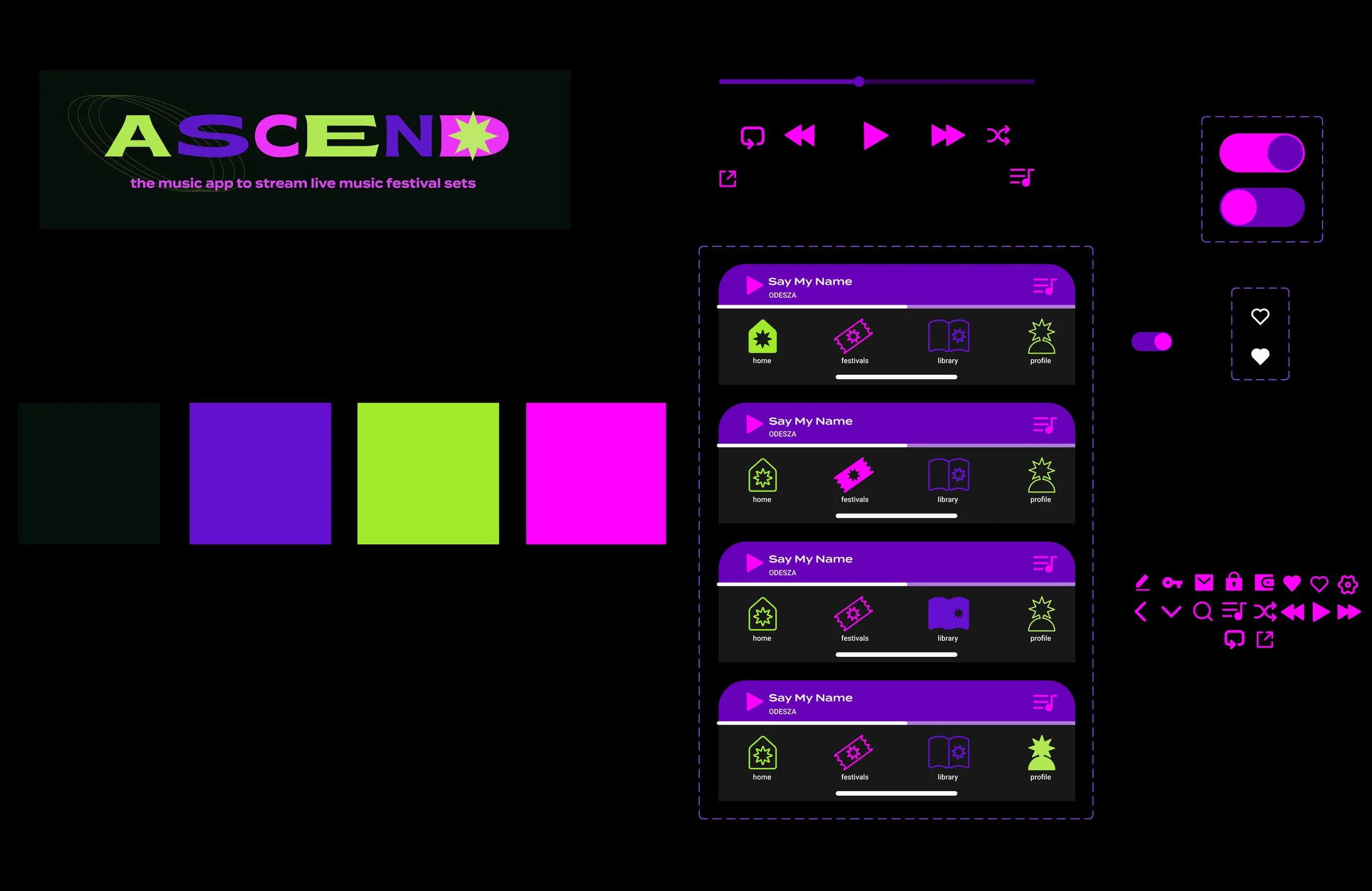
This was where we started to define our brand identity, establish our design system, and bring our grey prototype to life. Together, we created a moodboard that combined my ideas and Megan's ideas. Fortunately, our visions for the app were pretty aligned, and any disagreements were easily resolved with a compromise. Inspired by our moodboard, we established a typographic system, design elements, and color palette that were then incorporated into our first high-fidelity prototype.
Research
and Ideas
Throughout the design process, my partner and I kept this page available for whenever we needed an unorganized space to get out some ideas, write reminders, paste links, or store notes to refer to later.
This was our final prototype with all design elements, content, and user flows in place. We wanted a colorful and energetic design that would appeal to our target audience: Those who enjoy going to festivals and would benefit from having festival-related information and music more easily accessible.
Here is a short clip of one of the features in the app. You can like and unlike a song and also add it to a playlist.
Final Prototype
Click through our final prototype
for this project!